This is default featured post 1 title

Go to Blogger edit html and find these sentences.Now replace these sentences with your own descriptions.

This is default featured post 2 title

Go to Blogger edit html and find these sentences.Now replace these sentences with your own descriptions.

This is default featured post 3 title

Go to Blogger edit html and find these sentences.Now replace these sentences with your own descriptions.

This is default featured post 4 title

Go to Blogger edit html and find these sentences.Now replace these sentences with your own descriptions.

This is default featured post 5 title

Go to Blogger edit html and find these sentences.Now replace these sentences with your own descriptions.

Showing posts with label Editorial. Show all posts

Tuesday, October 9, 2012

Bullett Editorial Takes Cues from Alec Soth


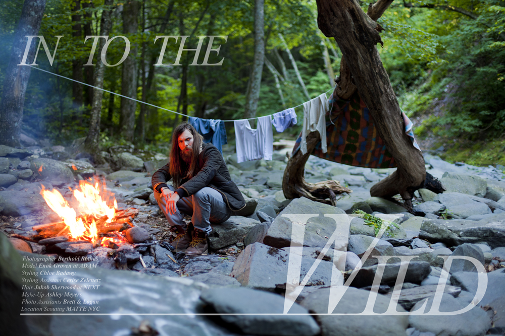
I came across this editorial photographed by Berthold Rothas for Bullett Magazine and was immediately struck by how much it reminded me of Alec Soth's work for his series and book, Broken Manual. According to Steidl books, Broken Manual "...investigates the places in which people retreat to escape civilization....[Soth has] created an underground instruction manual for those looking to escape their lives." While the two projects function in different ways and serve different purposes, the visual aesthetic is clearly similar. Rothas' photographs are intended to be seen in the commercial world, ultimately marketing the designer brands that the 'wild man' wears. The model 'escapes' into the wild with the civilized world literally on his back. Bullett and Rothas utilize and reference the visual vocabulary set forth by artists like Alec Soth and make the aesthetic both trendy and commercial. This isn't the first time we have seen the wild man aesthetic adopted into the fashion world; beards are a popular look on male models today. I think Rothas does a great job of capturing this 'wild man' and slightly voyeuristic aspect of Soth's work and reworking and reinterpreting the themes in a commercial and fashion setting. 


Images from Alec Soth's 'Broken Manual' Series:


'Into the Wild' photographed by Berthold Rothas for Bullett Magazine:


Thursday, June 17, 2010

Cinematic Narrative within Editorial and Advertisements


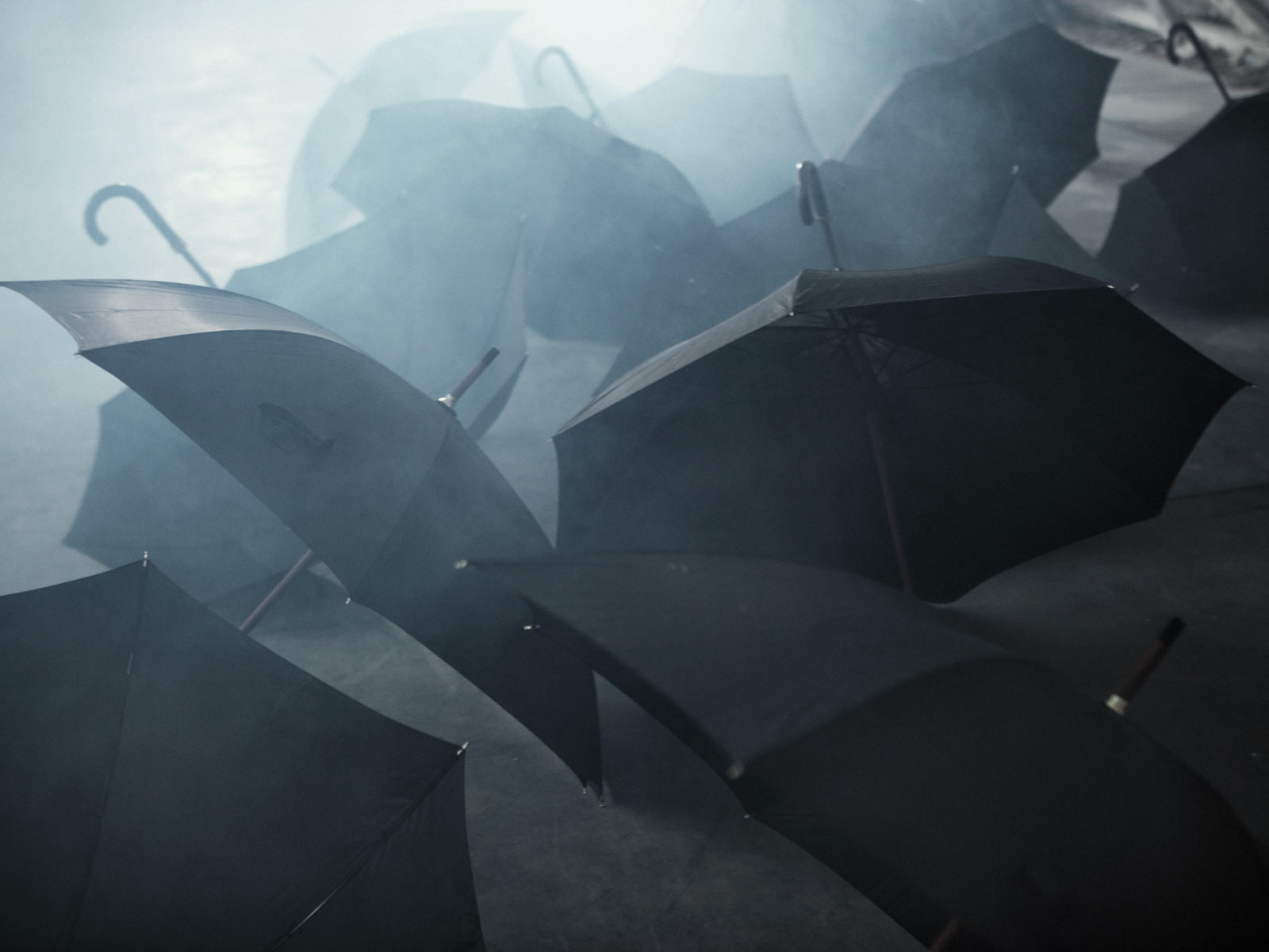
I love seeing editorials and advertisements with a cinematic and narrative feel. In these two shoots, we don't know what is happening (Why is he in a big warehouse with a lot of umbrellas? Why is he in a desert and what is he running from) but all the details have been left out and it is up to us to create our own narrative within our imaginations. I like that the images feel like a part of something bigger than what is actually shown.

These shoots blend both cinema and photography and I think it is a hard thing to do. Just like their their cinematic equivalent, making a movie out of still images, both formats seem to bridge the gap and combine elemental components from both mediums.


Luke Worrall photographed by Jospeh Cardo for Anthony Morato for their Fall/Winter 2010/2011 Campaign.


Images from yvymag.com.


Tyson Ballou photographed by John Balsom and styled by Allan Kennedy for the July 2010 issue of GQ France.


Images from thefashionisto.com

Monday, May 24, 2010

Strong Shots


I think it is really important when putting together a campaign, editorial, or portfolio to create a strong individual image. Now there are many times when the "whole" is greater than the sum of its parts, or when an idea and concept behind a group of images is more important than each image on its own, but the presentation is something that always needs to be kept in mind. Campaigns, for instance, are important as a collection to represent the overall tone of the image of the company, but the campaign images are rarely displayed as a whole collection. Instead you will see them blown up and dispersed around a store in various sizes, frames, and other ways the images can fit or enhance a specific store.

I try to post examples only of things I like, however I think the new Summer 2010 Campaign for American Eagle Outfitters is an example of a collection of images that (I think) aren't too strong on their own. My favorite image would have to be the second one down of the close-up of the model Aline Weber, but I still don't think it carries the campaign. I don't think each image that every clothing company puts out in a campaign needs to be incredible either, especially considering the teen demographic for American Eagle I don't think the consumers are expecting something photographically amazing, but from the standpoint of the marketing executives who ARE aware of photographic trends, I think they could be doing something a little bit different. The small flash on the beach seems unnecessary and although I know it is a stylistic thing, I think it feels a little too artificial for a company that tries to present a "natural", fun, playful, stylish and flirty feel both through their advertisements, and their product. None of these images are going to stick in my mind and the model and feel of the images are a little too serious to really be consistent with their other campaigns. (Here are some examples of campaigns from past years.)


Here is an editorial of Wiktor Hansson photographed by Shiro Katigiri for Pen Magazine May 2010. I think there are two editorials here coming together as one (the black and white location shots and the color studio shots). The black and white images are extremely strong both in part because of the lines and structural elements that they incorporate in the architecture and the lines of the model, and the spatial relationship of the model in relation to his surrounding. The poses are really strong and compliment the location. In the first image, the model is slightly curved like the lines in the building behind him. The black and white image with the model sitting down and the studio one below it are unique interpretations of a simple pose (sitting and standing) and really highlight the impressive facial structure of the model.


In the future I think it would be great to see innovative campaigns (more like the shoots that are coming out of more obscure art-fashion magazines like Pen) being produced by major retailers like American Eagle regardless of their demographic.

Share

Twitter Delicious Facebook Digg Stumbleupon Favorites More