I think it is fairly obvious that I love images. I take them, I look at them, and I organize them. One of my favorite ways to be inspired for shoots and ideas is to look at images and try and find similarities and consistencies that fit well together or contrast each other in interesting ways. I have countless binders of full-page images that I have organized into categories. For example I have one binder entirely for men, one for women, one for editorials, and one for campaign advertisements (organized by first name of the brand) among a few others.
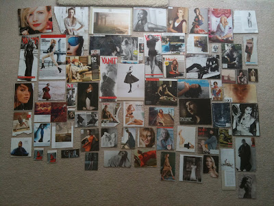
Because I have so many images it helps me to keep it all organized so that if I am going on a shoot I can pull a few images that I might have in mind or that might have a similar theme so I can have some sources of inspiration to play off of. I also have cutouts that I organize into smaller collages that I sometimes put together for a shoot. Today I spread all my images of women out so that I could go through them and start putting them into my sketchbook so I could cut down on the size of my folder. I have seven other folders full of cutouts of other subjects (like men, pairs, locations, objects, fashion, hair & makeup, and architecture). Looking at images of subjects that I am interested in photographing myself and thinking about them by organizing them is one of the best ways that I learn about what I want to go into. It is a great way to notice photographic trends, lighting patterns, styling inspiration and just about anything else.
-All images were taken by me, Mathea Millman, with an iphone camera in low light. The images are to give a sense of what I do rather than be crystal clear.
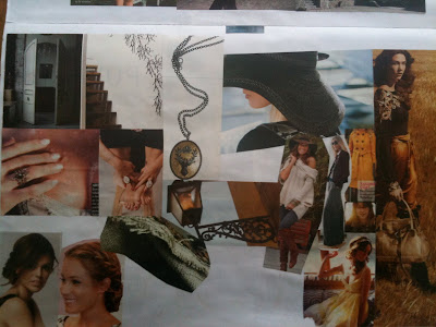
These first two images are all of my cutouts of just women portraits (what I was working on today):


This is a collage I put together for my project pitch for my final film (Limerence) for my Cinema Production class. There are elements that I included in the film such as braids, hats, antlers and product shots. Making these beforehand helps me find a visual emotion that I want to convey in my own work.

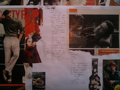
Again, here is another (incomplete) collage I made but this time it was for a photo shoot rather than a film shoot. I have color scheme ideas ( the red tones next to Channing Tatum on the left).

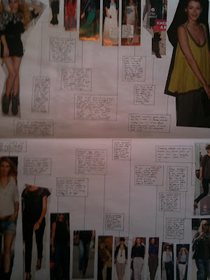
Lastly, here is another idea layout I had. I used cutouts of some of my favorite outfits from magazines and the little blurbs are about how I would incorporate the specific textures, colors, fabrics into a shoot to have it be an editorial fashion shoot and make the clothes an important piece of the portraits. These aren't full expanded ideas but rather starting points from which I could further elaborate on.


0 comments:
Post a Comment