This is default featured post 1 title

Go to Blogger edit html and find these sentences.Now replace these sentences with your own descriptions.

This is default featured post 2 title

Go to Blogger edit html and find these sentences.Now replace these sentences with your own descriptions.

This is default featured post 3 title

Go to Blogger edit html and find these sentences.Now replace these sentences with your own descriptions.

This is default featured post 4 title

Go to Blogger edit html and find these sentences.Now replace these sentences with your own descriptions.

This is default featured post 5 title

Go to Blogger edit html and find these sentences.Now replace these sentences with your own descriptions.

Monday, August 16, 2010

Simple Props


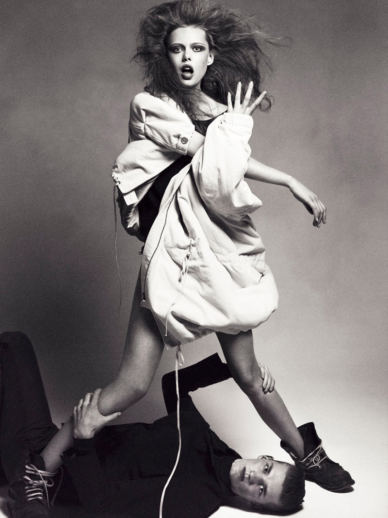
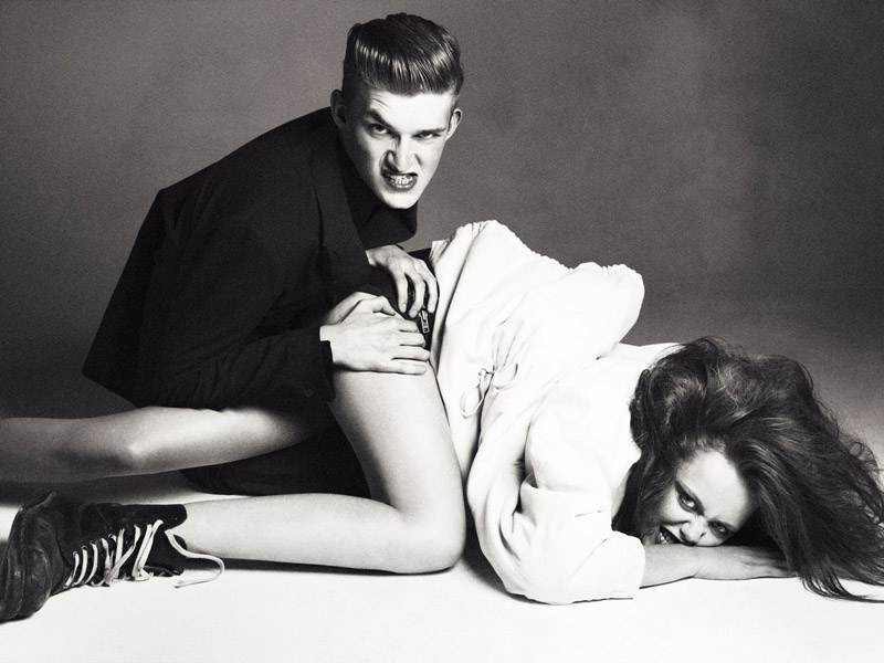
It is hard to incorporate props into studio shoots and do so in a way that adds something to the nature of the shoot. In this editorial, photographed by Andreas Sjodin for Elle Sweden, the creative team decided to use a piece of plywood as a prop. I think the result is simple and the prop is non-intrusive to the images and is really just there for the models to play with. The shoot has nothing to do with the actual prop itself, just the great lines and shadows that are a result of the inclusion of the wood.


Models: Frida Gustavsson, Charlie Westerberg
Photographer: Andreas Sjodin
Stylist: Lisa Lindqwister
Publication: Elle Sweden

Images taken from fashiongonerogue.com

Sunday, August 15, 2010

Styling


This shoot captures the amazing forms and lines of the clothes and really exemplifies what good fashion photography is about: incorporating the clothes into the scenes and making them matter in the entire scheme of the shoot (especially in the first and second images).


Magazine : Privé Asia
Issue: Winter 2008
Editorial: The Evangelist
Photographer : Baldovino Barani
Stylist : Holly Suan Gray
Make-Up : Angie Pasley
Model : Elyse Sewell

images taken from designscene.net


Saturday, August 14, 2010

Venus Envy


When I first saw this shoot I loved it, until I scrolled to the fourth image down and finished looking at all of the images in the spread. I was a little surprised by the smeared black makeup around the face and then I just started laughing. The inclusion of the two images with the messed up makeup absolutely ruined the shoot for me.

The subtitle under the title reads, "Raw emotion shows through the stark whites and blacks of these coveted spring designs". First of all, a woman with a completely placid expression does not mean that she has any "raw emotion" and I have to laugh at V Magazine for suggesting that it does. Second, those two images throw the theme and concept of the shoot way out of line and instead of taking any of it seriously, I burst out laughing because it seemed to be trying way too hard. The shoot is gorgeous and I love the soft light and how the edge of the bodies seem to melt off into the white background. The shapes and curves of the models and the clothes are beautiful, elegant and understated. I think the shoot would have been absolutely perfect without the two images that throw the whole shoot out of whack and the completely misguided subtitle.


Magazine: V (Spring 2009)
Editorial: Venus Envy
Photographer: Willy Vanderperre
Models: Natasha Poly & Raquel Zimmermann

Wednesday, August 11, 2010

Paradise Lost


I think this is an interesting spread and is also pretty memorable. The first image paired next to the title page is pretty unique and I absolutely love the forms and shapes from the models body and the architecture behind her. It is also a great contrast of the model next to the older woman. Other than that, I think it's rather funny that the models face is covered in all of the images except for the last one: not a real confidence booster. Actually, I don't mind the face being covered as much as I mind the duplication of the same pose with the black and white image on the left in the second picture down and the second from the last image with the pink outfit. I like the pose in each of the individual images but placed together in the same spread, it just seems like a mistake and makes those two images less meaningful.

. Besides the pose repetition I guess my other complaint with the shoot is that I don't really understand the inspiration or concept linking the oddly veiled model to the explanation under the title (It reads "The Buenos Aries underworld serves as a backdrop for the high drama of the pre-fall collections") or why the model appears exhausted and fainting. Don't get me wrong, I think the first image is wonderful but I don't understand it in relation to the larger concept. Is it supposed to be the high drama? I don't think the veiled woman sitting in front of the blackboard is necessarily drama-filled, instead it seems completely banal except for the commotion of the background blackboard.

Overall I really like the images in this shoot but I think in terms of concept and especially the words under the title (which are supposed to explain a bit about the concept or influence but end up confusing more than helping) the shoot didn't really come together. I don't understand why the production team needed to travel to Buenos Aries to photograph this spread. I liked the shoot a lot, I just wish that it had come together a bit more cohesively.


model: dafne cejas
photographer: sebastian faena
styled by robbie spencer

Images taken from absinthrill.com

Tuesday, August 10, 2010

Shoot with David


The day after I got home from NYC my friend David and I went over to Cornell to hang out and do some shooting. Here are a few pictures from the day.


I call this last one 'Afternoon With a Faun' ;-)

All images copyright Mathea Millman.

Monday, August 9, 2010

"Sensing Nature" in Tokyo


I came across this really unique installation the other day that is currently in the Mori Art Museum in Tokyo. It is one of three installations by Japanese artists featured in an exhibition called "Sensing Nature". Designboom.com has this to say about the show:

the three japanese artists / designers give abstract or symbolic expression to immaterial or amorphous concepts as well as natural phenomenon such as snow, water, wind, light, stars, mountains, waterfalls and forests. their ideas of nature suggest that it is not something that is to be contrasted with the human world, but that it is something that incorporates all life-forms, including human beings. the exhibition consists of newly commissioned works by each of the three artists, each attempting to stimulate our sense of nature through large-scale installations.

This specific installation by Tokujin Yoshioka is titled "Snow" and is 15 meters wide.

it consists of a scene depicting hundreds of kilograms of light feathers blowing all over and falling down slowly is meant to remind us of the snow scape of our memories and the beauty of nature which often exceeds our imagination. visitors to the exhibition experience the feeling of looking at or walking through a snowstorm.


All images taken by Tokujin Yoshioka.

Pairings


Images taken from tumblr. Let me know if you have any picture credits.

Share

Twitter Delicious Facebook Digg Stumbleupon Favorites More