This is default featured post 1 title

Go to Blogger edit html and find these sentences.Now replace these sentences with your own descriptions.

This is default featured post 2 title

Go to Blogger edit html and find these sentences.Now replace these sentences with your own descriptions.

This is default featured post 3 title

Go to Blogger edit html and find these sentences.Now replace these sentences with your own descriptions.

This is default featured post 4 title

Go to Blogger edit html and find these sentences.Now replace these sentences with your own descriptions.

This is default featured post 5 title

Go to Blogger edit html and find these sentences.Now replace these sentences with your own descriptions.

Wednesday, January 27, 2010

New flickr fav: doctor.boogie


(All of the images I am referring to are located below this post)

Today, I came across this photographer on flickr while I was searching for holga images. . I was immediately struck by these amazing structures that he photographed. I searched for sea forts on flickr a little bit more but almost all the rest were in color and I loved how the images from doctor.boogie were black and white and taken with his holga.

The images are a bit soft and look as if they are really old. The color images date the structures and make them seem more recent, while in black and white they remain in this other world. The absence of color make them mysterious, and the color oddly confuses these strange distant structures from another time and place, and puts them out of context in our familiar present day life of digital media and color. The holga camera specifically, has this amazing ability to make the images seem like something from another time and place. The time and setting become undistinguishable and the mystery keeps us guessing. The scene is directly out of a movie and I can make up any story I want about them. Why they were built, who used them, and all the events surrounding their use. Either that or I can youtube it and find out what they were really used for.


Sea Fort 311


Sea Fort 311
Originally uploaded by doctor.boogie

Sea Fort 312


Sea Fort 312
Originally uploaded by doctor.boogie

Sea Fort 311


Sea Fort 311
Originally uploaded by doctor.boogie

Red Sands


Red Sands
Originally uploaded by doctor.boogie

Sea Forts (Holga)


Sea Forts (Holga)
Originally uploaded by doctor.boogie


109
Originally uploaded by doctor.boogie

Hasselblad


In my photo class we are starting off with medium format color film. I am used to taking holga pictures which are medium format but they also have about 6 settings rather than all the f-stops and shutter speeds that a regular camera would have. The holga also takes square negatives, which I love and while there are a couple types of medium format cameras, the hasselblad is the only one that takes square negatives. It is so great to finally be in a class where everyone else is just as excited as I am.


http://www.flickr.com/photos/rgraves/2481622829/sizes/o/

Wednesday, January 20, 2010

Men from Lookbook


I generally try to check lookbook every couple days so that I can see what new looks are being posted. Here are some of my favorite images of men from lookbook. Sorry I don't have a link to the individual sites for the pictures but its been a while since some of them have been posted. You can find them all on the site.

These first two images I really love. They look like they could be for a larger editorial shoot for Teen Vogue or something. Right now I am having fun thinking of other pictures that I could see featured in this hypothetical shoot. I love this first one because it was shot in an outdoor studio (a backdrop outside). I love this look because the light is so even across the subject so in a way, the even lighting matches well with his even stance. There are no crazy shadows and no crazy poses, so this is an example of the light really complementing the tone of the photograph. The second one is a little bit farmer hipster and reminds me of a place that I love to shoot. I really am a sucker for open fields. I like the directness of the models and the fact that they are younger which makes their gazes, outfits, and poses a little more innocent.


These next three images are all in black and white which I find really interesting for fashion images. For this first one especially, we don't get any sense of the texture or colors of his coat or plaid vest underneath. I like the symmetry of the white walls and the darker door frame, which in turn, frame the subject. I like his easy stance and especially the coat which is nonchalantly draped over his frame.

I couldn't imagine this image being in color. The window is perfectly highlighting the subject without casting him in silhouette. The ladder is weird but the man's pose is strong and clean. I like that it is also a bit feminine in the way his arm just gracefully falls down and how his back is curved.

For this one I basically just like the angle, the barrenness, and the presence of wind to push the man forward. He reminds me of the somnambulist (on the right) from The Cabinet of Dr. Caligari.
I love the location for this shot. I want to go there and I really like how his outfit matches his location. He seems to belong there and I like how it seems rather effortless.


To me, his seems more of a magazine image than an editorial shot but I liked his curved back, his glare/stare and his boots.

Just a fun jumping shot. I really like the coat and the patterns behind him on the wall. Again, I feel like I might see this in an urban outfitters catalogue or something.

I liked this urban feel and his outfit.

What I love about this is the strong pose of the model. It really contrasts with a softer masculine pose like the one above of the guy on the ladder. He is strong and totally facing us. He isn't hiding and could be seen as maybe confrontational. Like here I am.

Tuesday, January 19, 2010

Nirrimi


As many of you know I have my own flickr site (even though I haven't updated in a while), and I use flickr to look for new photographers and find inspiration for shoots and images. Its a great site to network and just to search for great images of just about anything.

This post is about a photographer that I came across a while ago actually and I recently revisited her work. I decided I had to tell other people about her. Her images are so beautiful and she can connect with her subjects in a way that is so hard to come by (especially for such a young photographer!). You can see her flickr page here. I wouldn't be surprised if I found her images in Teen Vogue and in fact, I think a lot of her photos are better than some of the work being featured in the magazine. Teen Vogue has amazing editorials of young stars and models and the way Nirrimi works with her models makes them appear as if they are beyond their teens. It is exactly the kind of fashion photography that is featured in Teen Vogue.

Her work has inspired me and is so beautiful to look at. I love her tones, the poses, and the styling. This is exactly the kind of fashion photography I want to be involved in and she makes me excited and passionate about this kind of work. You can check out her website here.

All images were taken by Nirrimi.


Monday, January 18, 2010

Otherworldly


Today I went out photographing at one of my favorite places. It is a beautiful trail and at the end is this old rusted bridge, which is absolutely gorgeous especially against the white snow. The rust is one of my favorite things about the bridge because it has so many colors and the texture and details are so beautiful.

-All pictures were taken by me with a Nikon D200.


This is a reflection of branches in a still pool of water:
I loved these shapes in the snow. The one on the left looks like a messed up version of pacman (kinda) and the one on the right reminds me of a whale. I thought they looked like they were having a conversation. No? Use your imagination. The ice wasn't this blue in real life.

The woods along the trail are dense and at one point it is all evergreen trees. I always feel like I am in some sort of enchanted forest.


Sunday, January 17, 2010

How I Think


I think it is fairly obvious that I love images. I take them, I look at them, and I organize them. One of my favorite ways to be inspired for shoots and ideas is to look at images and try and find similarities and consistencies that fit well together or contrast each other in interesting ways. I have countless binders of full-page images that I have organized into categories. For example I have one binder entirely for men, one for women, one for editorials, and one for campaign advertisements (organized by first name of the brand) among a few others.

Because I have so many images it helps me to keep it all organized so that if I am going on a shoot I can pull a few images that I might have in mind or that might have a similar theme so I can have some sources of inspiration to play off of. I also have cutouts that I organize into smaller collages that I sometimes put together for a shoot. Today I spread all my images of women out so that I could go through them and start putting them into my sketchbook so I could cut down on the size of my folder. I have seven other folders full of cutouts of other subjects (like men, pairs, locations, objects, fashion, hair & makeup, and architecture). Looking at images of subjects that I am interested in photographing myself and thinking about them by organizing them is one of the best ways that I learn about what I want to go into. It is a great way to notice photographic trends, lighting patterns, styling inspiration and just about anything else.

-All images were taken by me, Mathea Millman, with an iphone camera in low light. The images are to give a sense of what I do rather than be crystal clear.

These first two images are all of my cutouts of just women portraits (what I was working on today):


This is a collage I put together for my project pitch for my final film (Limerence) for my Cinema Production class. There are elements that I included in the film such as braids, hats, antlers and product shots. Making these beforehand helps me find a visual emotion that I want to convey in my own work.


Again, here is another (incomplete) collage I made but this time it was for a photo shoot rather than a film shoot. I have color scheme ideas ( the red tones next to Channing Tatum on the left).

Lastly, here is another idea layout I had. I used cutouts of some of my favorite outfits from magazines and the little blurbs are about how I would incorporate the specific textures, colors, fabrics into a shoot to have it be an editorial fashion shoot and make the clothes an important piece of the portraits. These aren't full expanded ideas but rather starting points from which I could further elaborate on.


Wednesday, January 13, 2010

Pepsi Refresh Project


My friend Seth Nenstiel wanted to get a project together for the summer and apply for the Pepsi Refresh Project Grant. The $25,000 grant is awarded to a determined individual or team who has a project that they need funding for. The way to get the grant is to get the most number of votes through the website:


Today we talked about the project and along with Jay Salbert, we decided to create a team and enter this grant competition. Our project idea is to use the money to travel across the country and interview people who have achieved personal success. Our goal is to interview community leaders, politicians, independent artists, musicians, philanthropists, and other people that we encounter along the way. We would create web episodes of our travels along the way and at the end we would create a longer film which we would then try and circulate.

Voting starts February 1st and we are going to need everyone we know to help vote for our project and support our endeavor. We would love to pursue our idea this summer and help others. By receiving this grant, we could really make this happen. Feel free to ask any questions.


Tuesday, January 12, 2010

One Size Fits All and the V Magazine Size Issue


One of the magazines I subscribe to is V Magazine and I just received the size issue. I loved all the shoots with plus size models, they wore the garments beautifully and the photography was exceptional. Overall, I would definitely go online and check out some of the shoots or pick up a copy in borders or wherever else V Magazine is sold locally. What I really hated about the "size issue" is that there needs to be a special issue dedicated to plus size models in order to feature them in these magazines. I most definitely understand the use of tall and thin models in the fashion industry, however it is up to the fashion industry to explore new shoots, and ways of looking at clothes and people and I think it is sad that the only chance that consumers have to see "normal" looking women is when there is a specific issue dedicated to them. I don't mean to imply that we should see plus size models in every shoot in every magazine but I loved what V Magazine did in my favorite shoot in the issue One Size Fits All (photographed by Terry Richardson) and I think it is a shoot that I wouldn't be surprised to see in a "normal size" issue.

I thought the concept was innovative and progressive to feature the same clothes on both an industry standard model and a plus size model. It had a great message and the images were beautiful studio images. In the second image down, I would say that I prefer the way that the plus size model looks. The model Crystal Renn has been the center of a lot of media stories in the past couple months because of her book Hungry which described her battle with Anorexia in the fashion industry and how she overcame the pressure to find herself and become a plus size model. I hope that we see more shoots like this in the future.

Check out the website for V Magazine:

This is the caption for the shoot:
Photography Terry Richardson


Monday, January 11, 2010

The Third and The Seventh


My friend Valera just shared this film with me and I feel like I need to share it again. Typically, when I watch films on youtube or Vimeo I check to see how long they are so I can anticipate how long I will be sitting and watching it. I think it has something to do with my impatience. However, I started watching this film and not once, did I check to see how long it was. I honestly didn't care because it was so beautiful that I wanted to keep watching. It is a film about images and visual passion. The string music was beautiful and peaceful and when it swelled, I could feel myself respond physically to the beauty of the music and the corresponding images. The camera is always moving and the music helps push us along in the same way the images do. The depth of field is so beautiful and the clarity of the filming made me fall in love with seeing. I loved the use of the split screen. I think it is really hard to find two images or scenes that are connected visually but show enough of a difference to make the images work rather than confuse. I loved the slow pace of the filming. His film makes me want to be in these places he films. I want to be in the library and the windmill farm. He makes me feel serene and alone with his clean images but just enough so to feel happy about it. The solitary beauty makes me happy, not isolated. There is a connection between the man and his camera. I can feel him looking through his lens at the scenes with the same passion I would. I think this is film for anyone who can let themselves be slowed down by incredibly beautiful and incredibly technical shots. The CGI is absolutely flawless to the point that I didn't realize the entire film was CGI until I read the caption underneath. If you watch the film and still don't believe it (like me) then watch the compositing breakdown on Alex Roman's Vimeo page. I'm speechless. I hope I can share this film and I hope it will inspire someone the same way it has inspired me.

Saturday, January 9, 2010

Finding Inspiration in Antiques


Today I went to a couple antique malls in and around Ithaca. I love antique malls because I can find so many interesting, beautiful, and unique things that I might never normally think about. I can go into an antique store and find an interesting trinket and I can think of a moment in time or a scenario in which the thing might have been important. Before I got into photography at the end of middle school, I used to write all the time. I would usually write little vignettes and short scenes from stories. It was hard, and still is hard, for me to visualize an entire story. I was a part of a writing group for a couple years and every time we would meet our instructor would have things out in the middle of the group for us to use as inspiration for our writing for the day. Sometimes she would have lists of words that we would have to use, sometimes there would be images, and sometimes there would be objects. When I saw and touched the images and objects I would immediately think of a scene or a moment. I could create these places in time by using these objects to transport me somewhere else. I think that my love for antiques came from my writing. I love thinking of stories and when I am in antique malls I am constantly thinking of other places in time.

Today I went around to have fun and find interesting things but also to find some inspiration for new shoots. There is so much to learn from antiques and it never gets old (pun not intended). Here are some things I found. All the images I took with an iphone camera.


I loved these hats resting upon one another. It gave me an idea to group accessories together in a shoot, to place them somewhere in the background to give more examples of a certain "look":

This was a piece of fabric made into something to hang on the wall. I liked the idea of using fabric as a background because there are so many amazing patterns, textures, and colors, and paired with a contrasting outfit could look really good:

There was this back corner of hanging rugs. I loved that they were hanging and they look like backdrops. They would make amazing backdrops especially paired with an outfit of neutral or muted colors:

Another example:

I think antique malls can be great for finding color inspiration and color pairings. The turquoise and the gold contrast well and compliment each other very nicely. These aren't common colors to see paired nowadays:

Here is another beautiful example of gold and turquoise. The gold color in this bowl is copper. One of my all-time favorite styles of design is art nouveau, and I thought the lines and colors in this bowl reminded me a little bit of traditional art nouveau designs:

Again, I loved the contrast of this bag between the snake skin and the red in the middle. Another inspiration for pairing textures and colors:

I love love love love bottles, and boxes. This was a beautiful leather coated bottle with an intricate design pattern. I could imagine this in a shoot with a pastel color for the clothes and then some sort of beautiful brown leather accent:
I always look for old pictures at antique malls. I really liked how this fountain looked like feathers. I could imagine doing some sort of diptych with water, or a fountain like this paired with a close-up of some sort of feather accessory:
Here is a great example of art nouveau designs incorporated into jewelry. I would have bought this brooch if it weren't almost $70. One of things I love about art nouveau are the intricate swirls and patterns which are definitely apparent in this piece:

Again, more art nouveau designs but this time incorporated into an armoire. Love it:

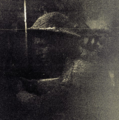
I saw this image and actually spent a few moments looking at it. I love everything about it from her bouquet to the arching structural supports to the right of the bride. One of the most gorgeous things about this image other than the face of the bride is the beautiful fanning of the bottom of her dress. The soft swirls visually complement the arch to her right. Absolutely stunning. It was also framed in a gorgeous dark mahogany frame. The dealer had a caption that read "1936 Jewish Bride photo in original wood carved frame". Too bad it was $255. Pricy but definitely one of my favorite images I have ever found in an antique mall (it wasn't actually this yellow):

Another framed portrait. I really liked the fence and the contrasting verticality of the fence posts and the telephone wires in the back. Interesting image:

This was a box that a held a lot of old photographs. I really liked the label "instant ancestors". I thought that could be a great title for a shoot or short story. I also think its a great way to think about all of these old photographs that end up here. Make up your own story about who they were, what they did, what their lives were like, who they loved:

There are so many amazing details in antique malls that are waiting to be found. This is a clasp on a black hand-embroidered purse. The clasp is a little art deco and there were little jewels in it. Beautiful design that would normally go unnoticed:

Share

Twitter Delicious Facebook Digg Stumbleupon Favorites More